Monday, May 19, 2014

Full Bathroom - Before and After!

I was on vacation (in Florida!) for the past week, so I didn't write a darn thing :)
And while I was gone, the house was pretty much completed! I'll be moving in this week!

So, leading up to that, I want to share the before and after transformations with you.
This full bath was in the original layout of the house, but boy did it need a makeover.

Here is the hall bath BEFORE:
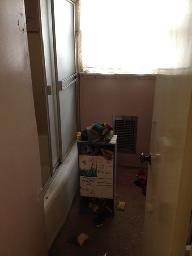
photo 2 (14)
This was the view looking into the bathroom from the hallway. Yes, those walls are pink.
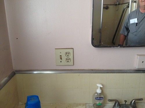
photo 1 (7)
Pink walls, yellow backsplash with chrome edging and a nasty medicine cabinet. That's my dad in the mirror.
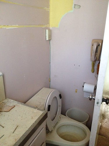
photo 1 (17)
The toilet. And telephone.

photo 3 (17)

photo 1 (15)
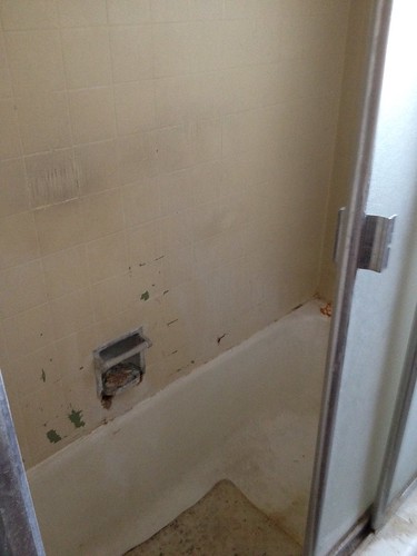
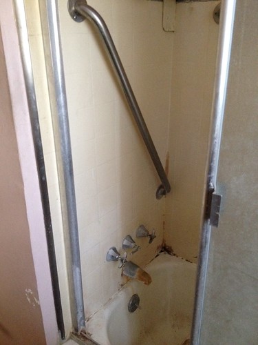
The yellow tiled bathtub - all original everything.
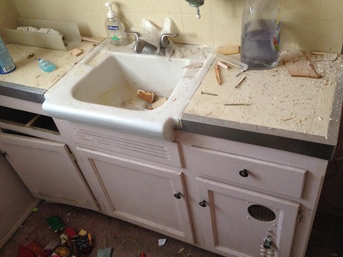
photo 4 (11)
The vanity was a nice size, but ancient, broken...and pink.
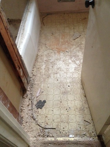
photo 2 (3)
The linoleum floor was yellow.

Now onto the DURING photos:
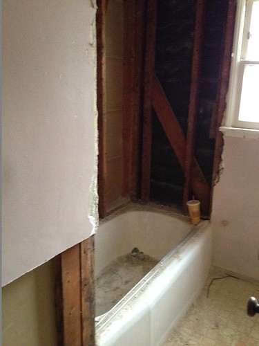
photo 1 (3)
The walls come off so the new shower tile can go up!
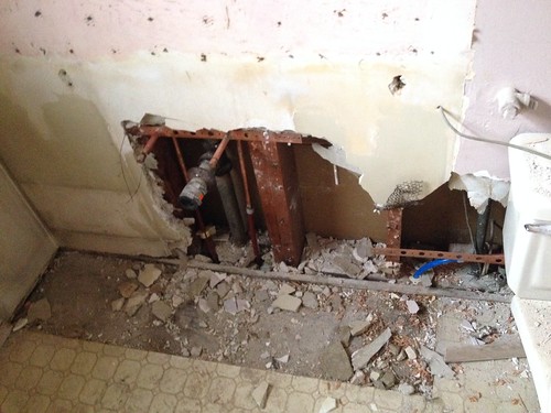
photo 3 (3)
The vanity comes out so we can add copper piping and redo the electrical.
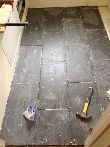
photo 3 (46)
The new flooring goes in! This gray, rectangular tile runs through both bathrooms and the kitchen.

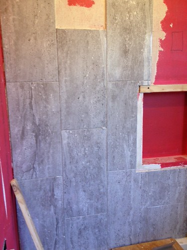
photo 5 (3)
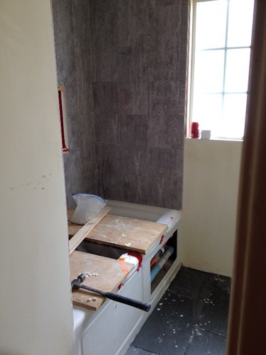
The gray, rectangular tile goes up on the shower walls.

photo 4 (45)
We laid the tile vertically to create a feeling of more height in the 8 foot room. You can also see the new whirlpool jet tub in this picture.
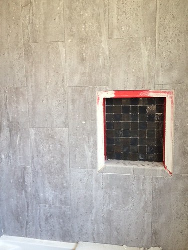
photo 4 (42)
The shower niche has contrasting tile work.
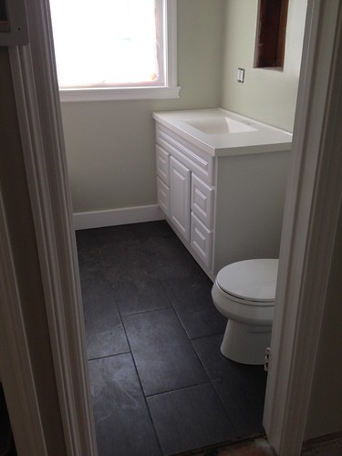
photo 2 (25)
The new toilet and vanity go in!

And finally, here are the AFTER photos:
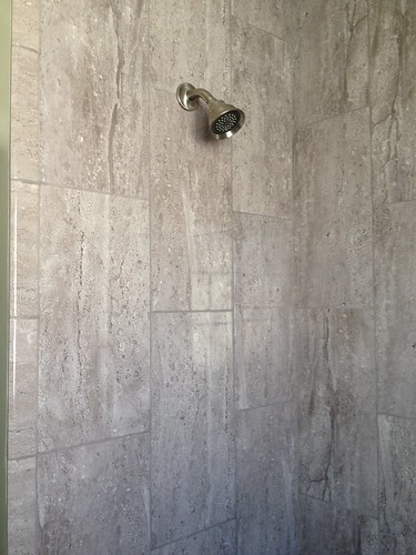
photo 1
The finishings are in!

photo 4 (14)
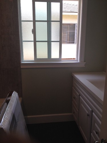
The new window is frosted and spiderfree. Definitely important features. 
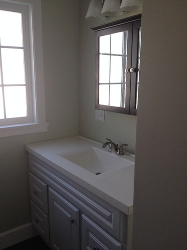
photo 1 (4)
The new vanity, along with the new faucet, medicine cabinet and lighting. I love how the 48" vanity has a molded sink, so there are no seams to clean!
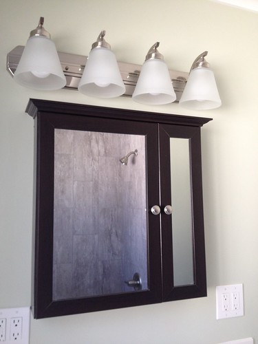
photo 2
Here is a better view of the medicine cabinet. I chose an espresso color to add some contrast and character to the white cabinet. I also like how the dark wood pulls in the dark tones from the shower niche. Isn't the asymmetrical opening on the cabinet awesome? It was the first one I noticed in the store.

There will actually be more photos (the AFTER AFTER photos), once it's decorated.

Sunday, May 11, 2014

A Letter From My Mother


{this is a letter my mom wrote to me when 
i was almost twelve and in seventh grade. 
she's always written me letters. 
before i was born, when i was a baby, 
when i made mistakes, when i succeeded.}

Happy Mother's Day, Mom!


This was originally posted on my first blog, Kate & Oli, in 2010. 


Tuesday, May 6, 2014

A Light Obsession

A look at my lighting board on Pinterest will show you that I 
a. can't make any decisions 
b. love all the little lights or 
c. have a varied and eclectic taste

Probably a third of each.

We originally planned to put recessed lighting in the foyer, kitchen, and living room. It made a huge improvement, especially once we smoothed out those popcorn ceilings. Like most houses built in her time, Linda relied on lamp light in the living areas. That's kind of reminiscent of Sally and her sea shells, right?


Above is a scary before picture of those ceilings. Those lines aren't shadows, they're dirt. Gross. 


This was the foyer (which is being really generous since it's a dirty postage stamp). I wanted to put a cute chandelier here for about 5 seconds, until I realized that both the front and closet doors would hit it. :(


As you can see, the recessed lighting (and smooth ceilings) are a vast improvement. This picture was taken before the lighting trim was in, which is why it looks a little rough. 

In the bedrooms, we started out with these very 50s plate fixtures.  


I thought the fern etching was kind of fantastic, but when the electrician gave us a great deal to upgrade to recessed lighting in the bedrooms and hallway, we went for it. 


This was the old hallway light... Seriously, Grandpa?


The new hallway lighting looks 10,000 times better and since it's all LED, costs 10,000 times less, as well. 


This beauty hung over my grandparents' dining room for as long as I can remember. It's vaguely nautical and maybe could have been craftily fixed up, but I was overwhelmed by the brass... and the disgusting.  So out it went!


Enter my beautiful dining room flushmount. I'm in love with her. The soft amber glow of her Edison bulbs, the the industrial/farmhouse/rustic/hispter/modern feel of her cage, even the fun patterns she makes on the ceiling. We are soulmates. 


And when she's off, she's just as beautiful, only in a more austere, Ice Queen sort of way. You guys, she has a personality! 

Unfortunately, I don't think I have any pictures of the original lighting in the kitchen, but I'm sure you can gather it wasn't terribly updated (or clean). 


First, we added a row of  3 lights down the center of the kitchen. There's also one to the left, since the pantry snakes around the corner and there are two smaller cans above the sink. Accent lighting, duh. 


We added in a Solatube, which are amazing, economical alternatives to a skylight. I love Solatubes and I try to incorporate them into designs whenever possible. 


In the kitchen, we knocked out a wall, which allowed us to create an island peninsula. As we all know, peninsulas need special lighting. In order to showcase...the peninsula. Duh. As soon as I saw these beauties, I knew they had to be mine. They're black, but with some burnished copper/bronze areas and they tie in nicely with the bronze hardware in the kitchen and the dining room fixture. I also put Edison bulbs in these, so they're not energy-efficient, but they're gorgeous. #worthit


In the bathrooms, I REALLY wanted to go with these awesome industrial fixtures.


However, in a conversation about saving money and being efficient, my Dad and I (read: my Dad) decided that the bathrooms should NOT carry through the more expensive oil-rubbed bronze accents that I have in the kitchen and should instead have brushed nickel accents. And much more cost-effective lighting with much more cost-effective bulbs. 

So, I picked up these acceptable, slightly better than builder's grade bath bars at Home Depot. 


They're actually not bad, and I rather enjoy the arc of the piece holding the shade. It looks like they're dangling streetlamps. Or maybe Trojan helmets. 

That's it for the interior lighting changes, stay tuned for another post on the exterior lightingscapes!

Monday, May 5, 2014

Using Podocarpus (Fern Pine) As A Privacy Screen

I like firefighters. You probably like firefighters. Most people like firefighters.

They provide a service, they're courageous, and they save kittens from trees. 

Plus they work out a lot. 

I like firefighters. 

But I don't exactly want to be able to wave hello from my living room, while I'm drinking tea in my undies. 


Hi Guys! See how the height of the fire truck complements the height of my wall and provides the perfect angle for them to see my skivvies?


And even when I'm outside, I can still see the building (and the Carl's Jr. sign). Though the flags are a bit festive.

So, what am I going to do about it? Well, we already had the retaining wall removed (read about that here) and now we have this lovely dirt strip about 5 feet deep. 


I went to my local nursery, International Garden Center, and asked the knowledgeable staff for some assistance. We discussed bamboo (too invasive), bougainvillea (too much maintenance on the fire station side), and we ended up in front of a plant called a podocarpus, or a fern pine.


This guy will start out about 5' tall and will end up 10-20 feet tall. We are going to plant 11 of them along the back wall, which is 53' wide. They have a nice, leafy spread that I'm hoping will end up looking like this.

{via}

A thick, leafy, green wall that is low-maintenance and relatively drought-tolerant. And most importantly, allows me to drink my tea with some privacy. 

I can't wait to share pictures of what it looks like once the plants are in. Expect that update in about two weeks!

Thursday, May 1, 2014

I Just Bought - Colorful Plaques and Plates!

Yesterday was a good day for deliveries! I ordered these adorable fiesta-inspired mini plates from H&M Home (my new favorite online home decor stop) and they just arrived!


At only 3.5" square, I assumed they'd be melamine (which I really don't like), but I was pleasantly surprised when they turned out to be porcelain. They'll work nicely for my upcoming Fiesta themed Housewarming party, but also as key dishes or candle holders. I could even use them in the kitchen, for cheese or berries, since they're food and dishwasher safe!


I also received two plaques that I ordered from Shabby Sign Shoppe. And I love them! All her offerings can be completely customized and I'm really happy with the colors I chose and the end results. The first is approximately 20" x 8" and reads "Scientia Est Potentia" which translates to "Knowledge Is Power." I plan on hanging this in the hallway, above the office door, and I love the personal meaning in it. My grandpa was an incredibly smart and well-rounded man - he was a renaissance man who knew something about everything. I like this little homage to him. 


Ahh, Italiano. How I miss the sounds of Italy. I was only there for ten days, but I swear it changed my soul. Since I don't have any plans to get back there in the next few years, I've had to settle for Italian lessons on my iPad, and Dean Martin songs. But this beauty takes me right back to a piazza in Sienna, drinking wine on a warm day. "La Dolce Far Niente" means "The Sweetness Of Doing Nothing," a concept the Italians have down pat. I think I'll put this beauty above the back door, to remind myself to go outside and enjoy that glass of wine on the patio. 

Have you picked up any fantastic purchases lately? Do share!

Wednesday, April 30, 2014

I'm Not Retaining This Wall!

There is a Jeff Foxworthy joke that goes, 

"If strangers regularly knock on the door to ask if you're having a garage sale, 
you might be a redneck." Or, you might be my Grandpa.

His backyard was chock full. He had THREE storage sheds and a whole side yard full of STUFF. I kept a lot of the really cool stuff - old metal carts that will definitely be fun projects to rehab, some useful file cabinets I'll put in the garage, and even some plastic lawn chairs that I plan on spray painting fun colors. But so much of it was junk!

So, after we got rid of the old lumber, the coils of wire, the metal scrap, and those sheds, we were left with a really good size backyard. It's about 20 feet deep and 53 feet wide. Unfortunately, there was a 5 foot wide retaining wall running along the entire back wall. There was also a huge ugly plant in the middle of it and some crazy ivy in the corner. 

{you can see the edge of the ugly tree on the left}


{attack of the killer ivy!}

At first I thought, "oh, it's a raised planter!" Then, I thought, "It's a jumping off point for a mischievous dog!" And it had to go. 


First, we had the huge tree removed (and no, there's NOTHING I can do about that ugly telephone pole). Then, we had them take down the wall!


And afterward, we were left with a big dirty stain on the wall and a 5 foot wide strip of dirt. 

{please disregard the toilet ;)}


What do you think I should do with this space? I'd like some sort of privacy hedge, but I don't want to deal with a lot of pruning or maintenance. Maybe bamboo? Also, it would be fantastic to cover that telephone pole in some way. Maybe a star jasmine vine? Give me your ideas!